Fractal Polarity
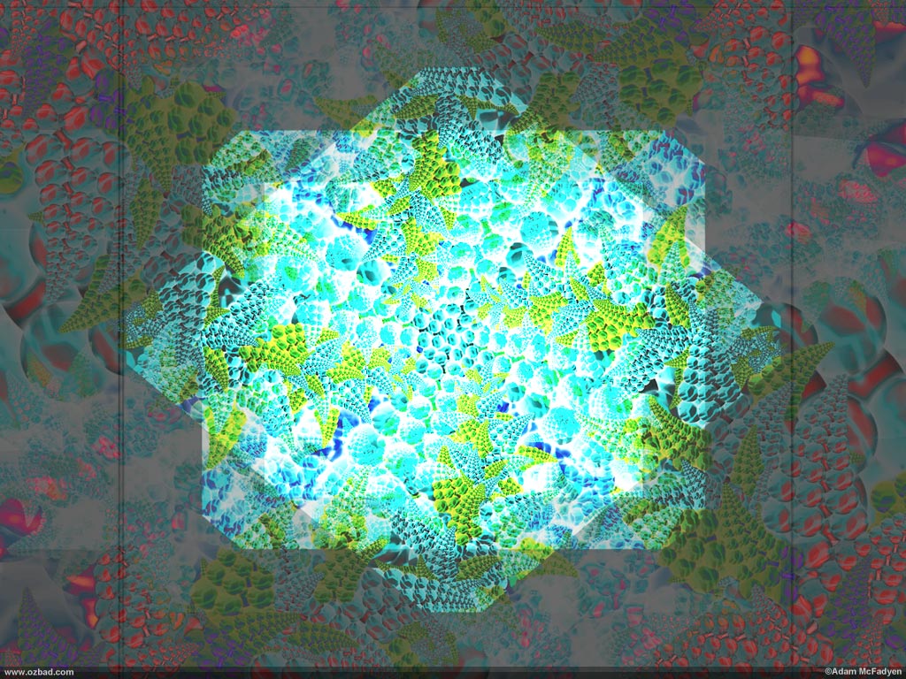
I love this piece. “Fractal Polarity” was part of an example I did for a photoshop-class. I made this graphic using the techniques described in this tutorial.
My favorite part about this piece is how the darker areas play with the screen when viewed from different angles. Normally (like when trying to watch a movie) having your blacks turn to blues is really annoying – but it works well here I think.
I know that the piece isn’t perfectly symmetrical – And I left it that way on purpose to highlight the imperfections that make perfection possible.


